About the Program
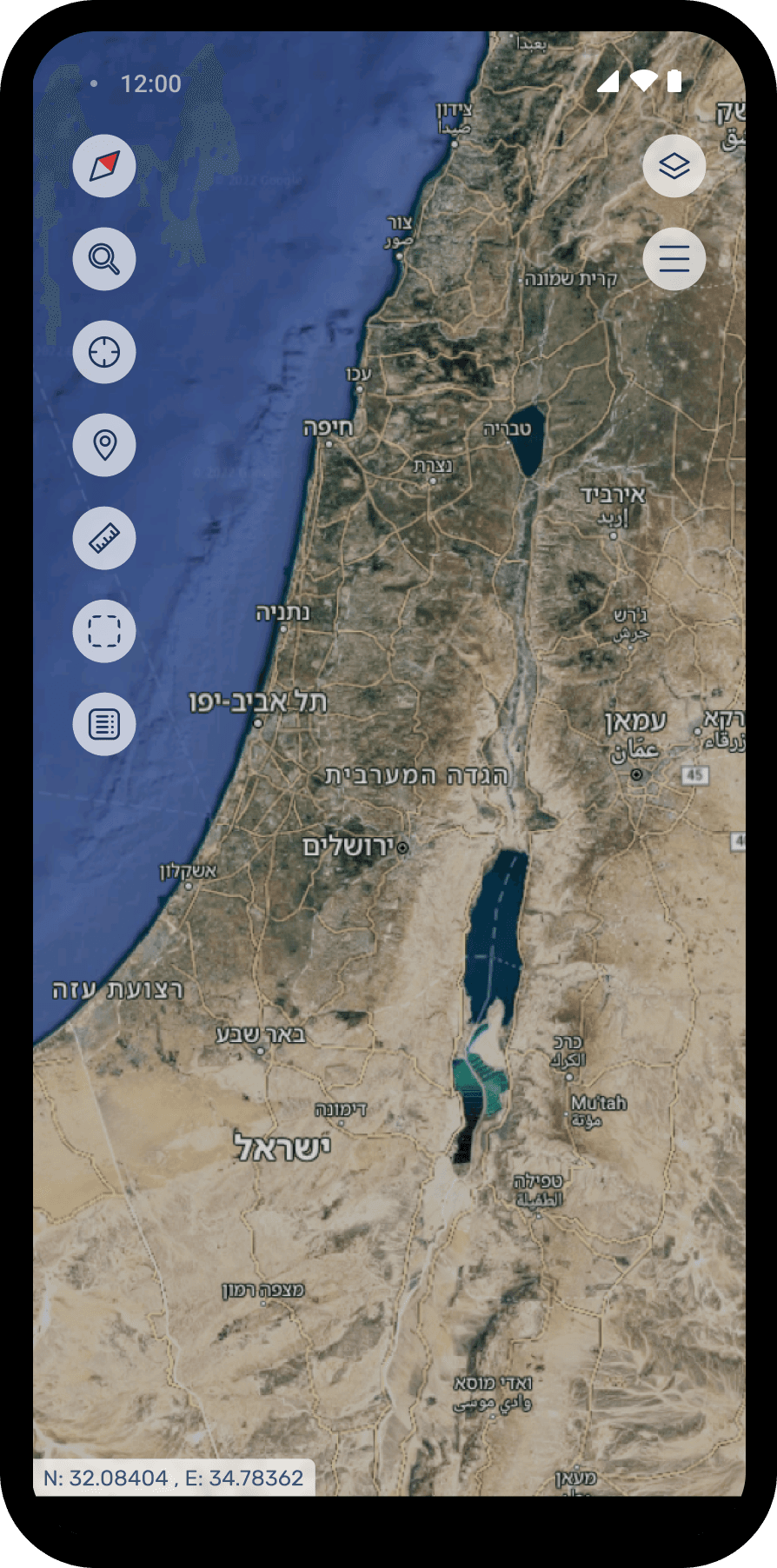
I led the UX for Mapit within a classified, Hebrew, military context, where aesthetics take a back seat to speed, clarity, and reliability.
My focus was on redesigning the interaction model and flow, making complex, multi layer tasks feel intuitive and keeping the critical actions front and center.
The result is a calmer, more natural experience that reduces friction without compromising capability.
Functionally, the system continuously updates to mirror live conditions, providing an accurate operational picture that enables informed, real-time decision-making
Making Headlines
This screenshot is taken from an article published on Ynet, where MAPIT was introduced to the public for the first time. The article highlighted the system’s rapid adoption across the organization and its reputation as a platform that everyone wanted to work with—largely thanks to its clean, intuitive design


The Challenge
01
My main challenge was to transform outdated, dense interfaces into a clear, modern experience that feels as natural as the civilian tools users know.
02
A major challenge in the Mapit project was organizing large amounts of spatial data in a clear and compact way, while maintaining balance between the panels and the map view.
03
Since the layers are pulled from an external API with uncontrolled titles and metadata, we designed flexible components that adapt seamlessly and allow quick access to information without creating visual clutter.

Original system: complex, non intuitive, and visually overwhelming
Key Findings
1. Map First Hierarchy
The map is the primary canvas. Panels stay lightweight/collapsible to preserve maximum space and keep situational awareness front and center.
2. Simplicity Within Complexity
As a widget inside complex systems, Mapit must feel fast and predictable. Clear affordances and quick actions keep the user in control.
3. Stay focused. Stay consistent
protect the widget’s core job while scaling. A shared design language (tokens, states, patterns) keeps behavior cohesive.
KPI'S
01
Map First Hierarchy
Measures the time from map load to the first meaningful interaction (zoom, layer toggle, search). A shorter time signals quicker time to insight and stronger user confidence.
02
Error & Undo Rate
Frequency of validation errors, mis clicks, and undo actions per session. A proxy for friction and cognitive load.
03
First Session Success
Share of first time users who complete a defined task without help or docs. Shows how discoverable and intuitive Mapit is on day one.
04
Task Completion Rate
Percentage of users who successfully finish key flows (turn layers on, draw & measure, export, search..). Direct measure of usability and clarity.
User Research
Target users
Active military personnel, reserve units and senior government officials operating in a closed, secure environment.
Profile
Relatively homogeneous workflows, with a broad age range that creates variance in technical proficiency and UI expectations.
Method
Through field observations and semi structured interviews, I watched operators work, listened to their frustrations with years old systems, and mapped their operational flow under time pressure. I focused on understanding pain points around discoverability and hard to execute actions, then sat with users to validate the core tasks and primary requirements that must remain front and center in a military context.
Understanding Users Needs
The map is the users’ language, critical visual cues can be life saving
The map must be clear and low noise, clutter directly harms situational awareness
Users need a one click “clean view” collapse/hide panels for an unobstructed map
Fast layer control is essential, quick on/off, search, and presets for common stacks
Rapid, non blocking filtering embedded in the dispatcher’s flow (no freezes or modals)
Work Environment & Habits
Closed network & strict protocols
Limited exposure to external tools. high emphasis on security, approvals, and auditability.
Legacy interaction patterns
Strong muscle memory around right click, context menus, dense layouts, and multi step flows.
Decision tiers
Senior officials need high level summaries and clear accountability; operators need speed, precision, and traceability.
Operational mindset
Procedure driven, reliability over novelty, minimal onboarding.
Pain Points
Visually dense, high complexity screens increase cognitive load and hide critical signals.
Capabilities hidden behind shortcuts keyboard/ right click reduce discoverability.
No immediate confirmation/ status/ undo undermines user confidence after actions.
Zoom and layer-render latency breaks flow, especially under time pressure.
Cross domain workflows blocked by access gaps cause dead ends and frustration.
Inconsistent military/ organizational terminology creates confusion across teams.
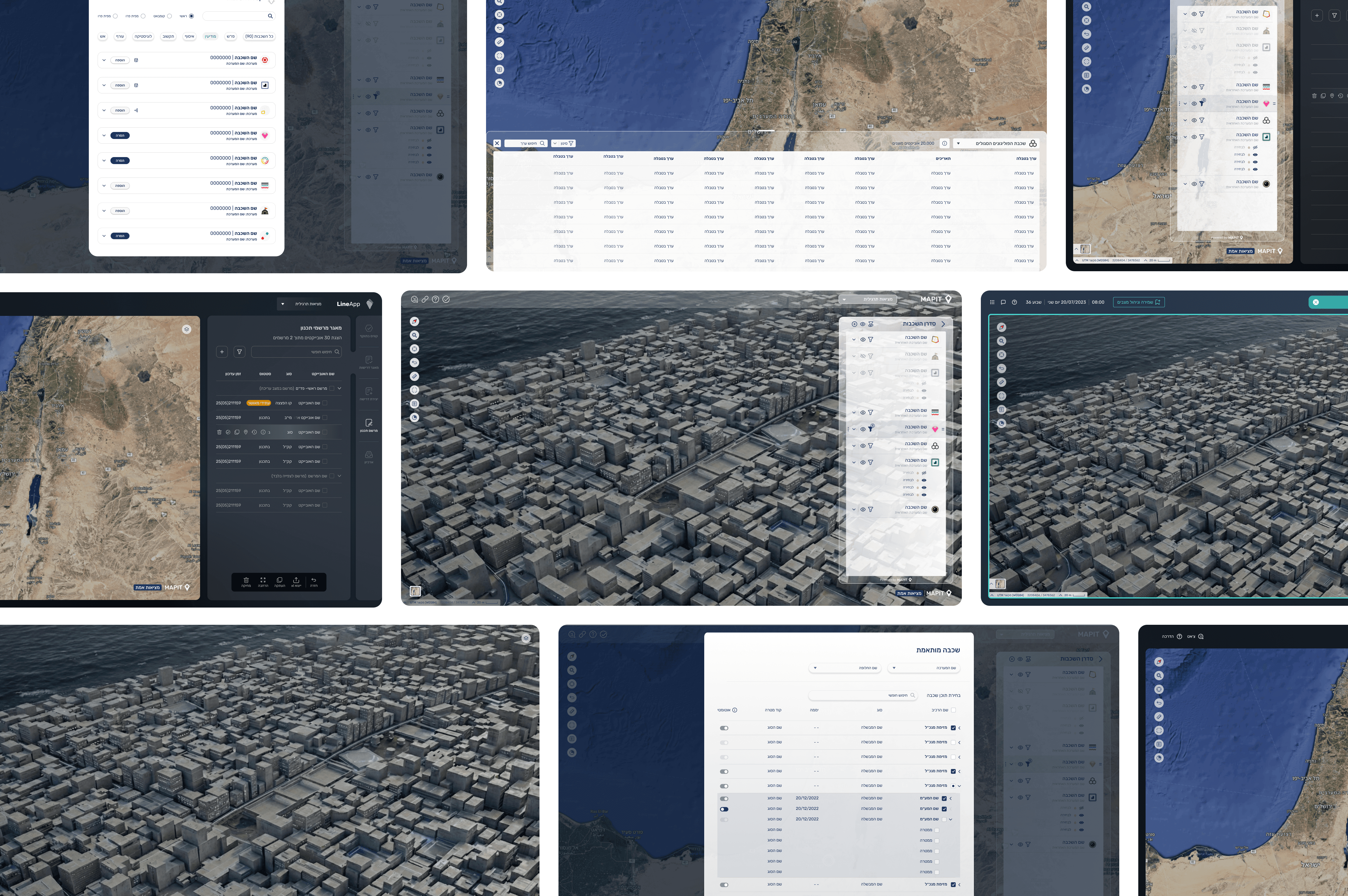
Wire Frame
Metrics & Outcomes
Daily usage increased meaningfully following the redesign
Adoption expanded, from a tool for senior ranks to one actively used by soldiers and field operators
Organization wide pull, multiple units requested to onboard the interface
Over the last two years and especially during security escalations, usage and demand scaled from hundreds to thousands of active users
-Boards-
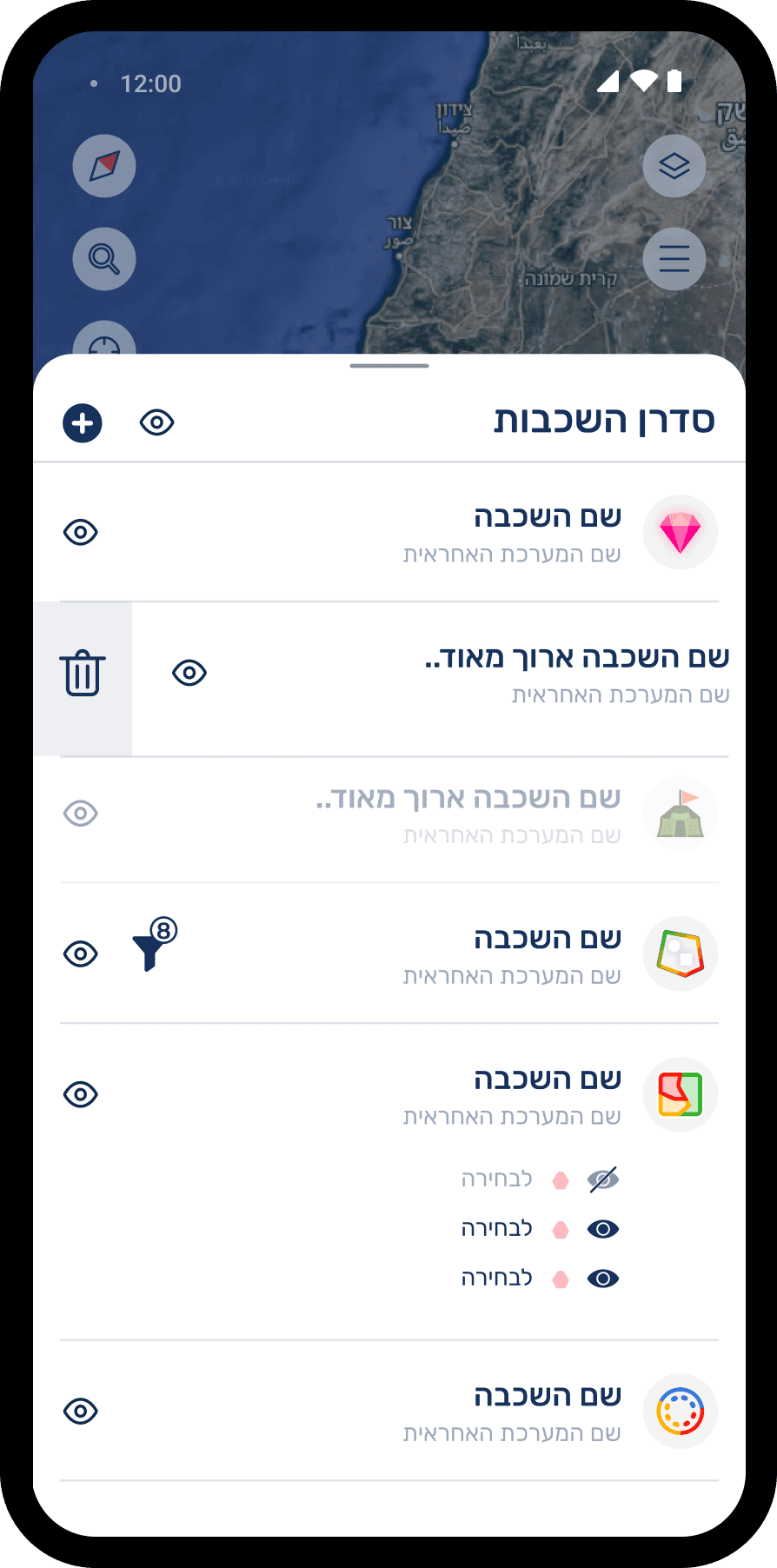
Main Flow - Layer Panel
The core user flow of the system, focusing on how users interact with map layers.
Opening the main layer manager and viewing currently active layers, with various visibility controls (such as show/hide, opacity adjustments, and more).
Filter Process
An updated alternative for filtering layers directly from the Layer Manager, a minimal element that supports a smoother, more continuous filtering flow
Old Filter Flow
Key Insights After User Testing
Filter access needed to be faster – users expected to open filters directly from the Layer Manager, rather than through a secondary menu.
Filtering should feel fluid and integrated with the map, allowing users to keep interacting with the map instead of freezing the screen.
Reduced visual overload – the full expanded panel showing every possible filter at once, felt heavy and overwhelming for users

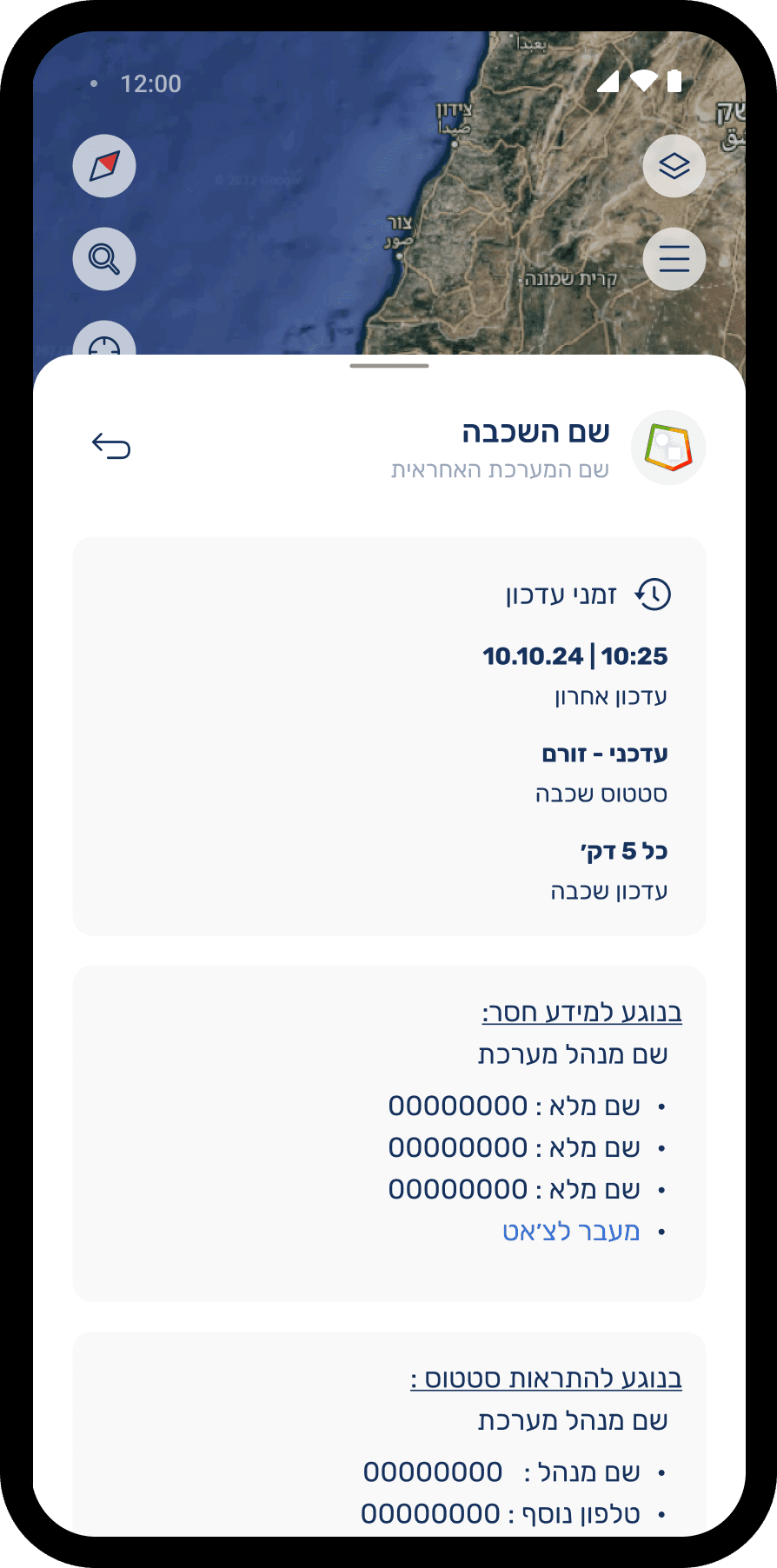
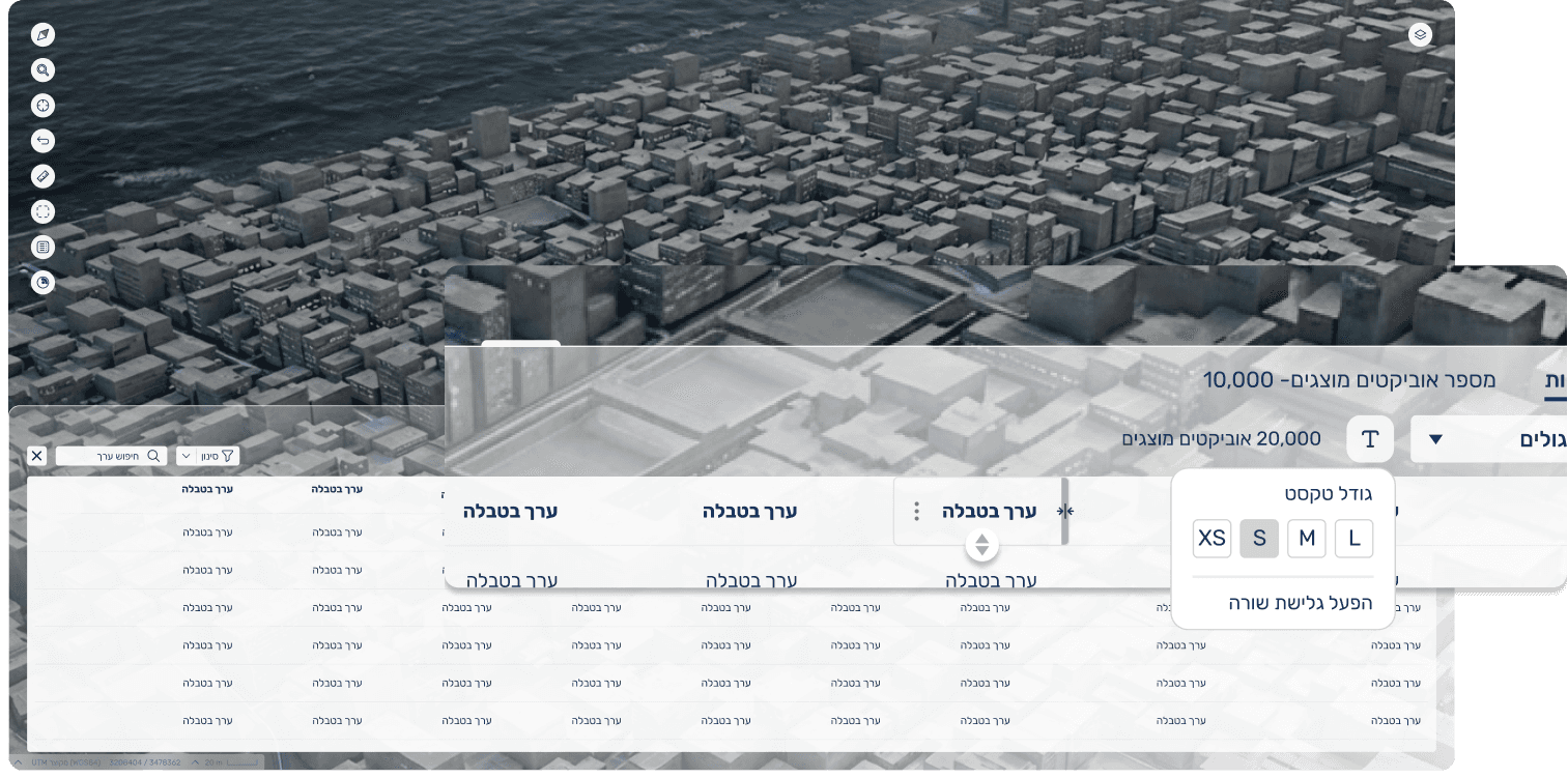
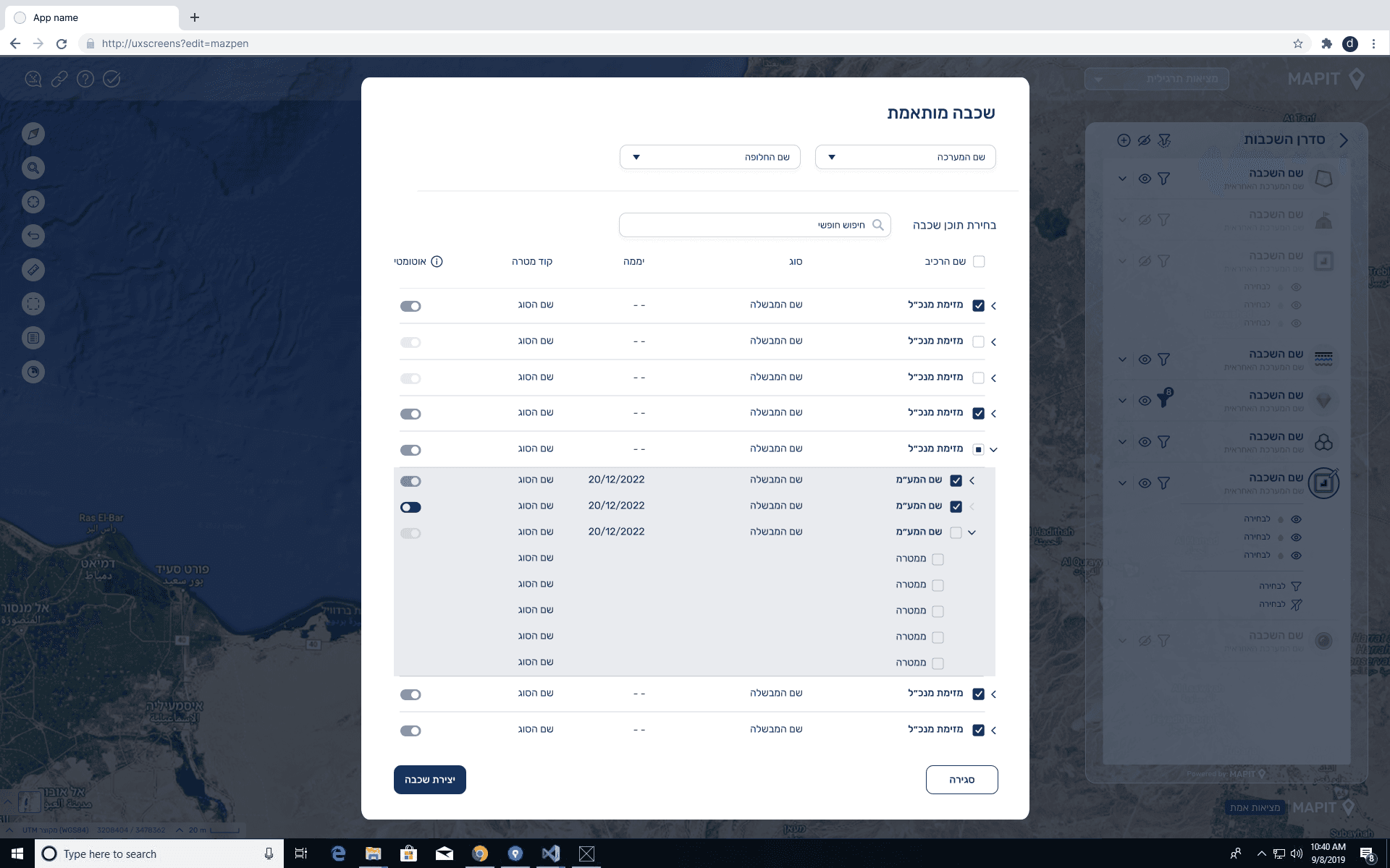
Data Table - Expanded Layer Information
The data table provides a broader and more detailed view of a selected layer from the Layer Manager.
It is divided into two main parts:
Layer Data View – displays the full dataset associated with the layer for deeper exploration, filtering, and sorting.
Layer Information Panel – includes essential metadata such as:
Layer update details
Source API
Permissions and access rules
Breakdown of sub-layers
Table Interactions - Key Insights After User Testing
Multiple text size options for better readability
Clear sorting controls for each column
Column expansion to view additional details
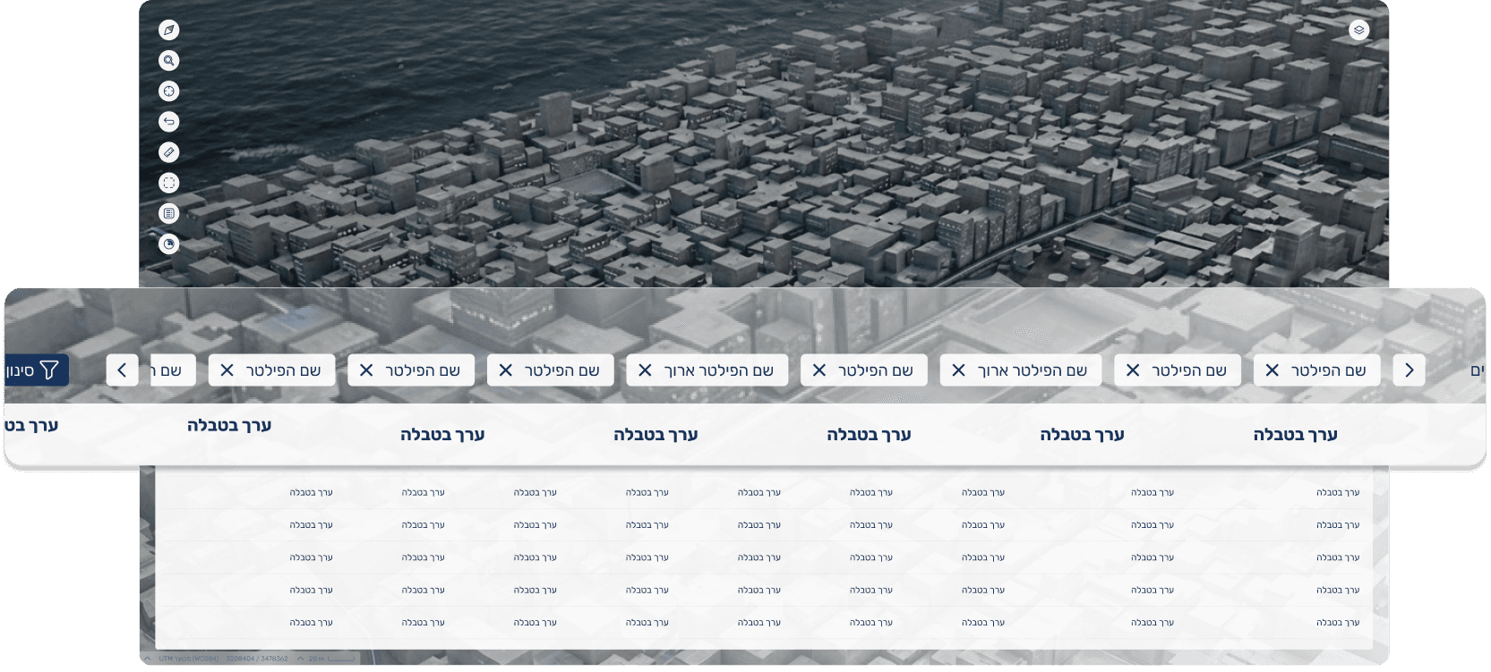
Edge case: many active filters
the UI allows clear viewing and navigation even with numerous filter chips
Mapit Widget
Map Widget Behavior
This video demonstrates how the shared map widget functions across the different systems.
The widget was designed as a flexible, reusable component that can be seamlessly integrated into multiple platforms, adapting its layout and behavior according to the specific needs of each system.It serves as the core interactive element, enabling consistent, intuitive map interactions regardless of context.
Custom Map Feature - UX Flow & Design Process
Incoming User Request
Existing feature allowed only basic map switching (similar to Google Maps).
Users asked for more control and access to a broader map catalog
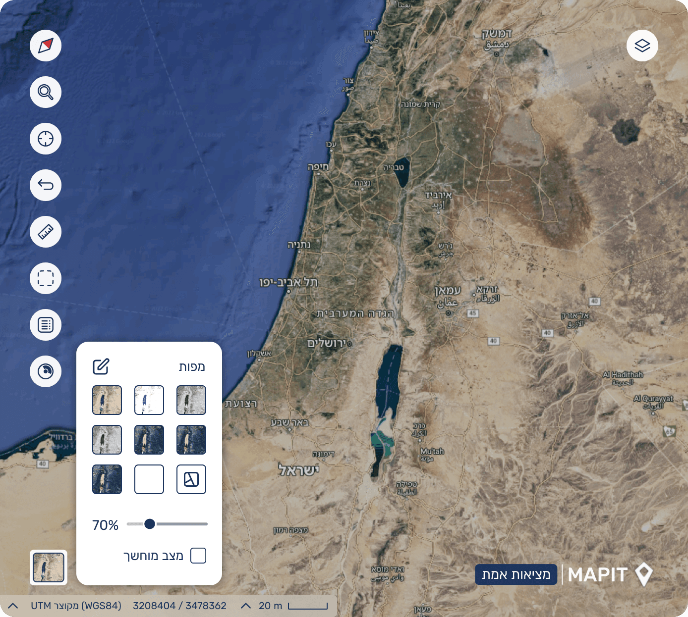
Understanding the Problem
Current solution was too limited for advanced workflows.
Users needed:
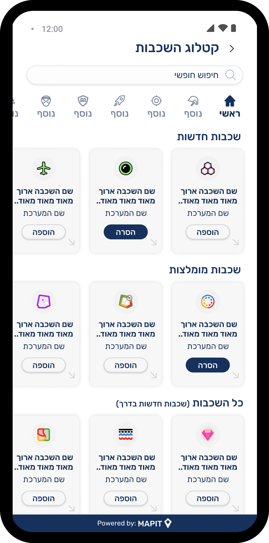
Access to a wide base of map sources
Ability to turn maps on/off
Adjust transparency
Reorder maps horizontally (layer priority)
A small, non intrusive UI that keeps map visibility clear
Research & Exploration
Reviewed existing map-based systems and UI conventions
Analyzed advanced GIS tools to understand common mental models
Ideation Using AI Tools
Figma Make
Nano Banana
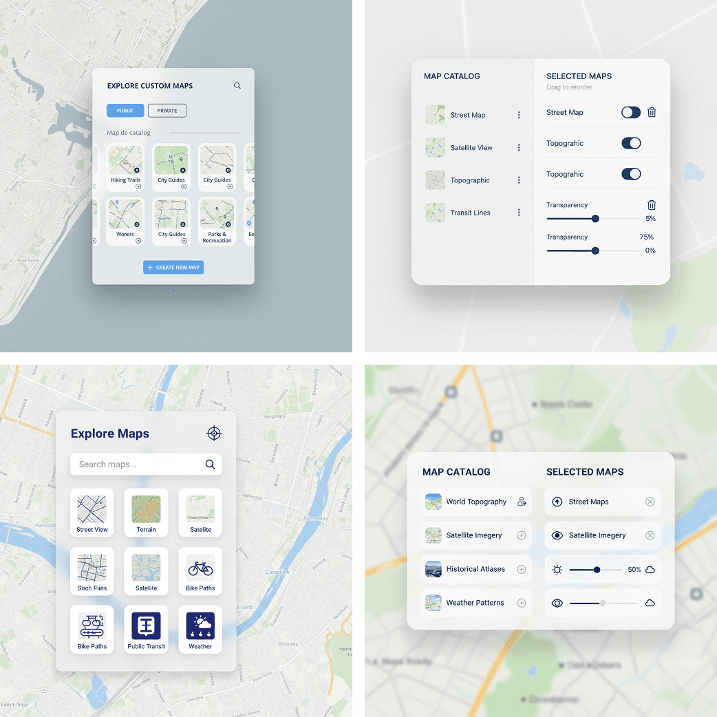
Final UX UI Direction
Dark Mode
Since Mapit is a widget embedded in larger platforms, there was a clear requirement to support hosts that run in dark mode and operate in low-light environments.
The entire design system was built with variables, so colors, states, and map styling can switch seamlessly between light and dark themes while keeping the same interaction patterns.
Map Widget in a Different System Context
This example highlights how the map widget is embedded and functions within a different system I designed.
Here, the widget adapts to a new use case and interface structure demonstrating its flexibility and modularity.
Despite the shift in context, the user experience remains consistent, supporting seamless interaction with spatial data.


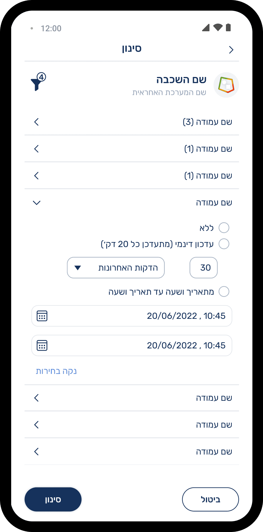
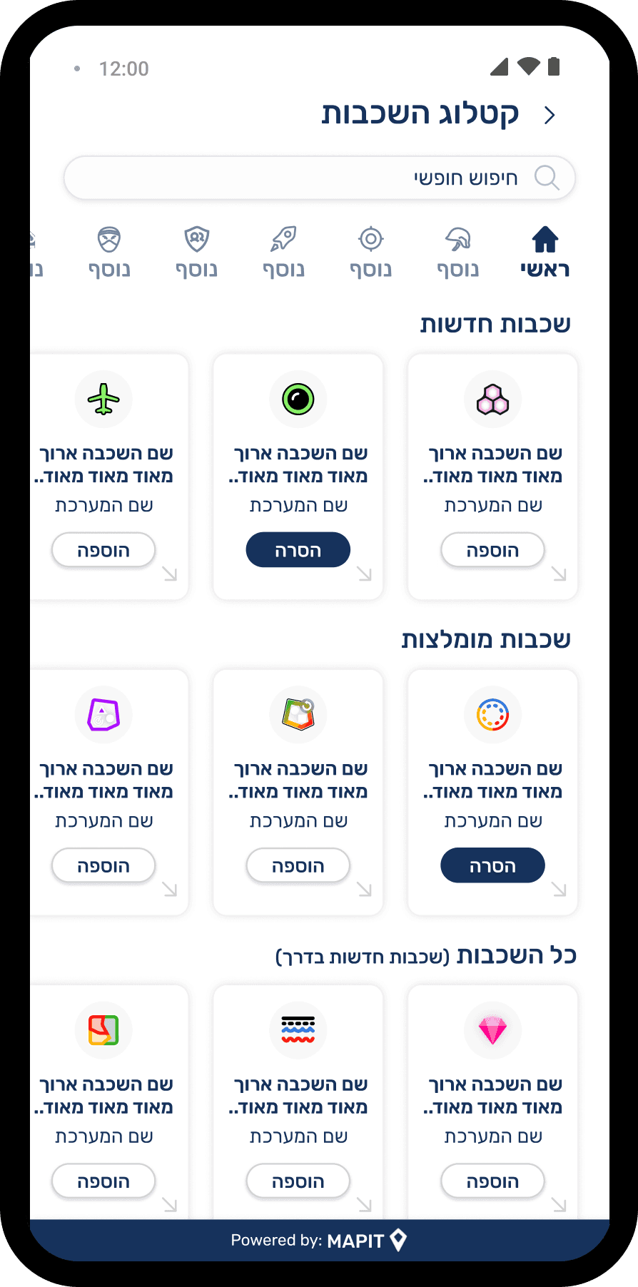
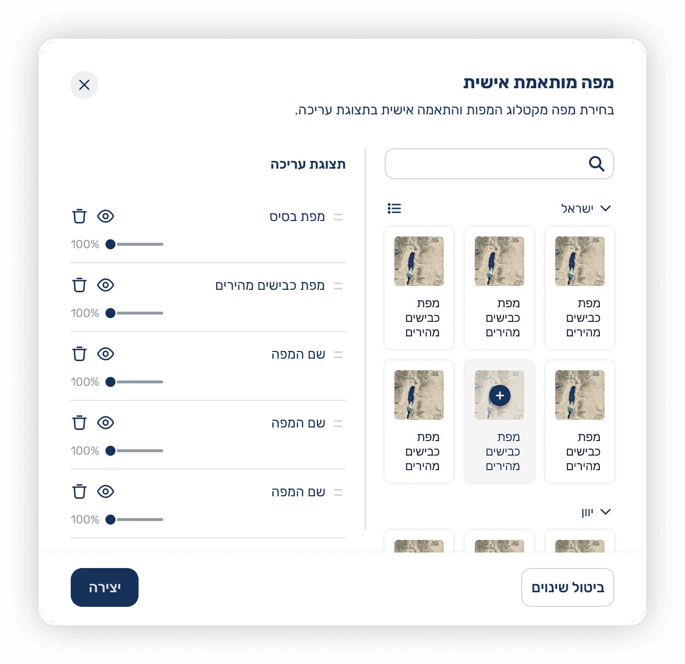
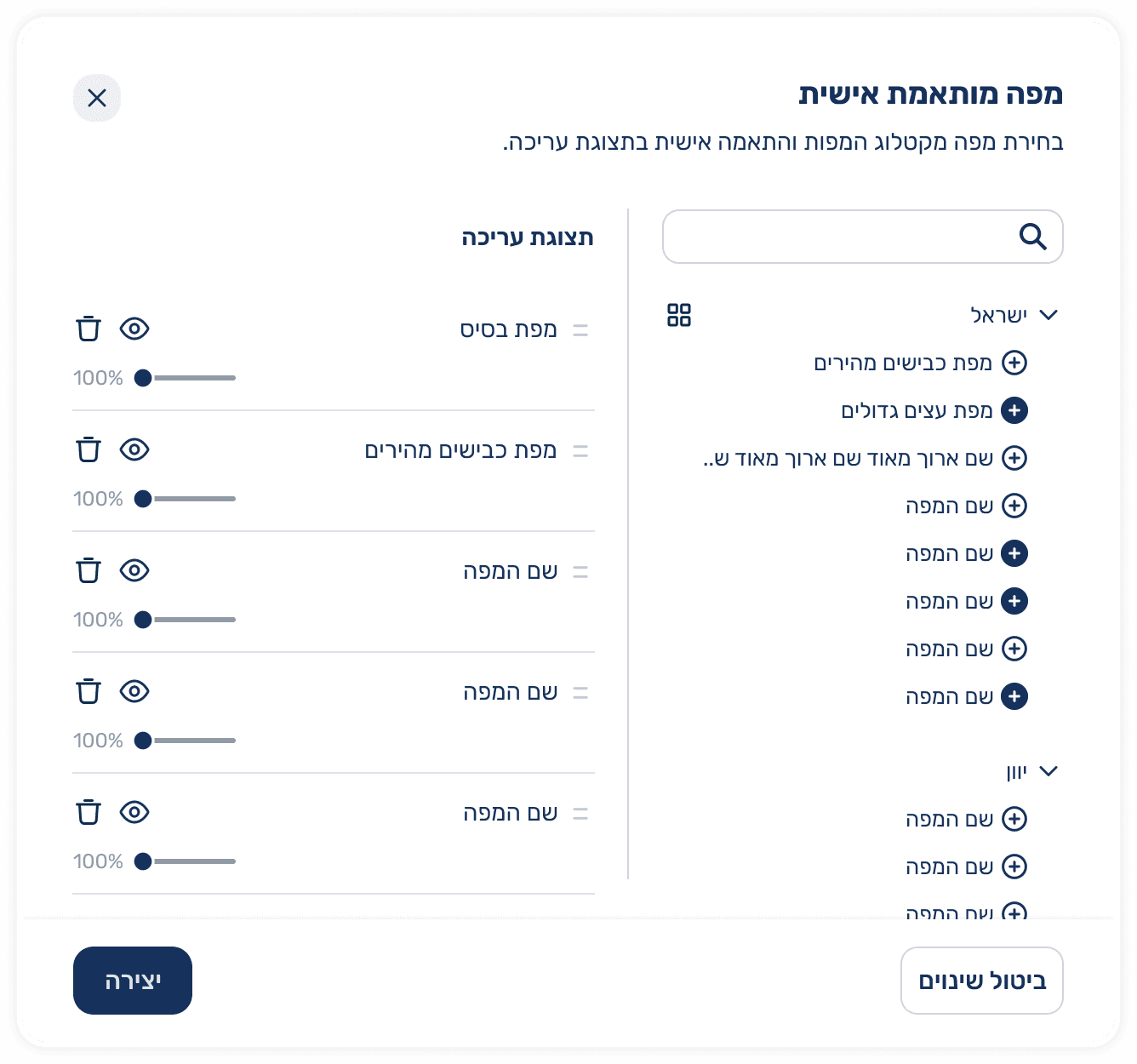
Custom Layer Creation
Users with the appropriate permissions can create a personalized map layer that is automatically added to the layer manager. The interface presents a dynamic, hierarchical selection flow tailored to the user’s specific needs, along with a capability selector that defines how the layer will update automatically over time.


This screen was part of an earlier design iteration for our mapping system, designed for large displays where minimizing side panels enables full screen map viewing. The concept focused on lightweight, floating panels with transparency to keep the map visible underneath. We tested a glass style panel with soft blur to achieve this effect, but performance issues arose the glass effect caused heavy load during map movements, preventing the smooth experience we aimed for.